Color vision
The hundreds of extra dollars that consumers agree to pay for a color TV over black and white means that the color experience is quite important to us. The complex apparatus of the eye and brain can perceive differences in the spectral composition of light reflected from visible objects, and it is easy to imagine what advantages this ability provided to our ancestors. One advantage, of course, was that it made camouflage more difficult for other animals: it is much more difficult for potential prey to blend into the surrounding background if the predator can distinguish not only light intensity, but also color. Color can be equally important when searching for plant food: a monkey will easily find a bright red berry that stands out among the green foliage, and this will give the animal a clear advantage, as well as the plant, since the seeds pass unharmed through the monkey's digestive tract and are dispersed over a wide area. For some animals, color is important in reproduction; examples are the bright red coloration of the perineal region of macaques and the amazing plumage of the males of many birds.
In humans, the selection pressure to maintain or improve color vision appears to be weakening, as 7 or 8 percent of men have partial or complete color vision loss but do just fine without it, a defect that often goes undetected for years and is only discovered after they run a red light while driving. Even those of us with normal color vision can truly enjoy black-and-white films, which can sometimes be artistic masterpieces. As we will see later, in low light we are all color blind.
The sense of color occurs sporadically in vertebrates; Probably, during the course of evolution, it was repeatedly reduced or even disappeared, only to appear again later. Mammals that have little or no color vision include mice, rats, rabbits, cats, dogs, and the night monkey. Ground squirrels and primates, including humans, apes, and most other apes, have well-developed color vision. Of the nocturnal animals, whose vision is adapted to weak light, only a few distinguish colors well; This suggests that for some reason, color discrimination and the ability to see in low light are incompatible with each other. Among other vertebrates, color vision is well developed in many fish and birds, but is probably absent or weak in reptiles and amphibians. Many insects have color vision, including flies and bees. For the vast majority of animals, we do not have accurate information about color vision, probably because behavioral or physiological tests of color vision are not easy to perform.
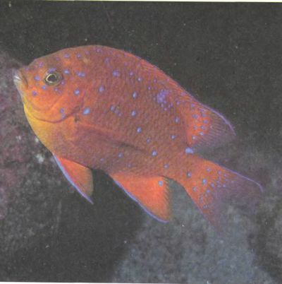
Rice. 115. Color is used in nature for a variety of purposes, some of which are not yet known. Blue spots on the sides of this fish (Hypsypops) become less bright as the fish grows and disappear when it reaches maturity. What significance these spots have for other individuals of the same species is unknown.
The issue of color vision, out of all proportion to its biological significance for humans, was addressed by a number of brilliant minds, including Newton, Goethe (whose forte was not, however, the natural sciences) and Helmholtz. Nevertheless, even artists, physicists and biologists often have a poor idea of what color is. The problem begins in childhood, when we are first given a box of paints and then told that yellow, blue and red are the “primary” colors and that yellow and blue make green. Many of us are subsequently struck by the apparent contradiction of this fact when, using a pair of projectors, we cast two overlapping spots, yellow and blue, on the screen and see in the area of their overlap a beautiful white color. The result of mixing colors is a matter of physics; the mixing of light rays is mainly a matter of biology.
When talking about color, it is useful to mentally separate these two aspects - physical and biological. The physics we need to know is limited to just a few facts about light waves. Biology includes psychophysics and physiology. Psychophysics is interested in our senses as detectors of external information, and physiology is interested in the internal mechanisms underlying them, in particular the work of our visual system. We know a lot about the physics and psychophysics of color, but the physiology is still at a relatively primitive level, mainly because the necessary methods have only become available in recent decades.
Nature of light
Light is made up of particles called photons, each of which can be thought of as a packet of electromagnetic waves. Whether a beam of electromagnetic energy is light rather than X-rays or radio waves is determined by its wavelength—the distance from one wave crest to the next: in the case of light, this distance is approximately 0.0000001 (10–7) meter, or 0.0005 millimeters, or 0.5 micrometers, or 500 nanometers (nm).
Light is, by definition, what we can see. Our eyes can perceive electromagnetic waves between 400 and 700 nm. Typically, the light that enters our eyes consists of a relatively homogeneous mixture of rays of different wavelengths; such a mixture is called white light (although this is a very loose concept). To estimate the wave composition of light rays, the light energy contained in each of successive small intervals is measured, for example from 400 to 410 nm, from 410 to 420 nm, etc., and then a graph of the energy distribution over wavelengths is drawn. For light coming from the Sun, this graph is similar to the left curve in Fig. 116. This is a curve without sharp rises and falls with a flat maximum in the region of 600 nm. This curve is typical for radiation from a hot object. The position of the maximum depends on the temperature of the source: for the Sun it will be around 600 nm, and for a star hotter than our Sun, the maximum will shift to shorter wavelengths - to the blue end of the spectrum, i.e. on our chart - to the left. (Artists' ideas that red, orange, and yellow colors are warm and blues and greens are cool are related only to our emotions and associations and have nothing to do with the spectral composition of light from a hot body, depending on its temperature - what physicists call color temperature.)
If we somehow filter white light, removing everything except a narrow spectral band, we get light called monochromatic (see graph in Fig. 116 on the right).
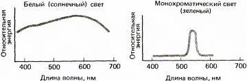
Rice. 116. Left: The energy of light (for example, solar) is distributed over a wide range of wavelengths - from approximately 400 to 700 nanometers. The weak peak is determined by the temperature of the source: the hotter the source, the greater the shift of the peak towards the blue (short wavelength) end. Right: Monochromatic light is light whose energy is concentrated primarily in a region of one wavelength. It can be created using a variety of filters, a laser, or a spectroscope with a prism or diffraction grating.
Pigments
When light falls on an object, one of three things can happen: the light can be absorbed and its energy converted into heat, as happens when something heats up in the sun; it can pass through an object if, for example, there is water or glass in the path of sunlight; or it may be reflected, as in the case of a mirror or any light object, such as a piece of chalk. Often two or all three events occur; for example, some light may be absorbed and some may be reflected. For many objects, the relative amounts of light absorbed and reflected depend on the wavelength. The green leaf of a plant absorbs long- and short-wavelength light and reflects light in the intermediate region of the spectrum, so that when the leaf is illuminated by sunlight, the reflected light will have a pronounced broad maximum at medium wavelengths (in the green region). The red object will have its maximum, also wide, in the region of long waves, as shown in Fig. 117.
A substance that absorbs part of the light incident on it and reflects the rest is called pigment. If some spectral components in the visible light range are absorbed better than others, the pigment appears colored to us. Let's immediately add: which one exactly The color we see depends not only on the wavelength, but also on the distribution of energy between different parts of the spectrum and on the properties of our visual system. Both physics and biology are involved here.
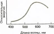
Rice. 117. Most colored objects reflect light, which usually has more energy in some parts of the visible spectrum than in other parts. Its energy distribution, however, is much wider than that of monochromatic light. This graph shows the spectral composition of light that will be reflected from a red object when illuminated by a broadband (white) source.
Visual receptors
Each rod or cone in our retina contains a pigment that absorbs better in some part of the spectrum than in other parts. So if we could collect enough of this pigment and look at it, it would appear colored. Visual pigment has a special property: when it absorbs a light photon, it changes its molecular shape and in doing so releases energy, thus starting the chain of chemical reactions described in Chapter 3, which ultimately lead to the appearance of an electrical signal and the release of a chemical transmitter at the synapse. The pigment molecule in its new form usually has very different light-absorbing properties, and if, as is usually the case, it absorbs light less well than in its original form, we say that it “fades” when exposed to light. The complex chemical mechanism of the eye then restores the original pigment configuration; otherwise, its supply would quickly be depleted.
The retina contains a kind of mosaic of four types of receptors - rods and three types of cones (Fig. 118). Each type of receptor contains its own special pigment. Different pigments differ from each other chemically, and therefore in their ability to absorb light of different wavelengths. The rods are responsible for our ability to see in low light, i.e. for a relatively crude type of vision that does not allow one to distinguish colors. Rod pigment rhodopsin has the greatest sensitivity in the region of about 510 nm, in the green part of the spectrum. Rods differ from cones in many respects: they are smaller and have a slightly different structure, are distributed differently in different parts of the retina, and have their own characteristics in the system of connections formed with subsequent levels of the visual pathway. Finally, the three types of cones differ from each other and from rods based on the light-sensitive pigments they contain.
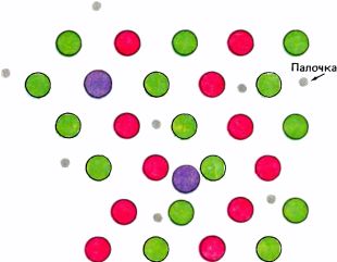
Rice. 118. Receptors in the retina form a mosaic consisting of rods and three types of cones. This diagram could show an area of the retina a few degrees from the fovea, where there are more cones than rods.
The three types of cone pigments have absorption peaks at 430, 530 and 560 nm (Fig. 119); Therefore, the different cones are somewhat inaccurately called "blue", "green" and "red" respectively. The inaccuracy is that 1) these names reflect maximum sensitivity (which in turn depends on light absorption capacity), and not what these pigments would look like if you could look at them; 2) monochromatic light with wavelengths of 430, 530 and 560 nm will not be blue, green and red, but violet, blue-green and yellow-green; 3) if only one type of cone could be stimulated, we would not see blue, green and red, but probably violet, green and yellowish-green. However, the above names for cones are widely accepted, and attempts to change ingrained terminology usually end in failure. More accurate names would be “long wave,” “medium wave,” and “short wave,” but they would make it difficult to understand for those not very familiar with the spectrum.
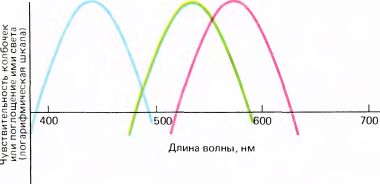
Rice. 119. The absorption spectra (or spectral sensitivity curves) of the three types of cones are different. (Ordinates on energy and absorption curves are plotted in logarithmic units because their values vary over a very wide range. Therefore, the position of the axis x arbitrary and does not correspond to zero absorption).
Having a maximum absorption in the green region, the rod pigment rhodopsin reflects blue and red rays and therefore appears purple. Since it is present in our retinas in quantities sufficient for chemists to be able to isolate it and look at it, it has long been called visual purple. This in itself is counterintuitive, since "visual purple" is named for its apparent color, while the names for cones ("red", "blue" and "green") correspond to their relative sensitivity, i.e. ability to absorb light. To avoid confusion, this should be kept in mind.
The three types of cones have wide zones of sensitivity with significant overlap, especially for red and green cones. Light with a wavelength of 600 nm will cause the greatest response in red cones, whose peak sensitivity is located at 560 nm; it will probably also cause some, although weaker, response in the other two types of cones. Thus, the “red” cone reacts not only to long wavelength, i.e. red light; it only reacts to it better than other cones. The same applies to other types of cones.
So far I have looked at the physical aspects of color vision: the nature of light and pigments, the properties of objects that reflect light to our eyes, and the characteristics of rod and cone pigments that convert absorbed light into electrical signals. It is the brain's job to interpret these initial signals as different colors. In order to better give a feel for the subject of discussion, I decided to first briefly outline the elementary facts about color vision, leaving aside for now the three-hundred-year history of establishing these facts, as well as the processes of processing color information in the brain.
General notes about color
It may be useful to start with how the two sensory systems—auditory and visual—operate with different wavelengths. The activity of one of them leads to the perception of pitch, and the other to the perception of color, but there is a profound difference between these systems. When I play a five-note chord on the piano, you can highlight the individual notes and sing each one individually. The notes do not mix in our brains, but retain their individuality, whereas it has been known since Newton's time that when two or more rays of light of different colors are mixed, you cannot distinguish the components by mere observation.
A little reflection will convince you that color vision must necessarily be a sense less perfect than the perception of tones. Sound arriving at any given moment in one ear and consisting of vibrations of different wavelengths will affect thousands of receptors in the inner ear, each of which is tuned to a pitch slightly different from the setting of the neighboring receptor. If sound consists of many wave components, the information will be received by many receptors, all of whose output signals are transmitted to our brain. The wealth of auditory information is determined by the brain's ability to analyze such combinations of sounds.
The situation with vision is completely different. The subject of processing in the visual system is an image captured at each moment in time by a set of millions of receptors. We instantly perceive a complex scene. If we also wanted to process wavelengths according to the principles used in the inner ear, then the retina would have to have not only a set of receptors covering its entire surface, but also, say, a thousand receptors at each individual point, each of which would have maximum sensitivity to its own wavelength. But it is physically impossible to squeeze a thousand receptors into every point of the retina; so there is a compromise to be made here. The retina contains three types of "color" receptors with varying sensitivity to wavelength at each of a very large number of points. Thus, at the cost of minor damage to resolution, most of our retina gains some ability to process wavelength information. We distinguish seven colors, not 88 (however, both numbers should be increased many times over to take into account shades), but each of the many thousands of points in the visible scene will be assigned a specific color. The retina could not have the spatial analysis capabilities it has while simultaneously processing wavelength information as sophisticatedly as the auditory system.
Now we need to give the reader an idea of what it means for our color vision to have three types of cones. First, one might wonder: if a given cone performs better at some wavelengths than at others, why doesn't the visual system simply measure the output of that cone and figure out from there what the color is? Why not then have one type of cone instead of three? Yes, because with one type of cone, say red, you would not be able to distinguish light with the most effective wavelength in the region of 560 nm from brighter light with a less effective wavelength. It is necessary to be able to distinguish changes in brightness from changes in wavelength.
But suppose you have two kinds of cones with overlapping spectral sensitivity curves, such as red and green cones. Now you can determine the wavelength simply comparison cone outputs. At shorter wavelengths, green cones will react more strongly; as the wavelength increases, the reactions of both cones will move closer and closer to each other until they become equal; At about 580 nm, the reds will begin to respond better than the greens, and this difference will gradually increase as the wavelength increases further. If we subtract from the sensitivity curve for some cones the curve for others (these are logarithmic curves, so we are actually taking ratios of values), then we get a certain curve that does not depend on the light intensity. Thus, the two types of cones together form a wavelength measuring device.
Why then are two types of receptors not enough to fully explain the properties of our color vision? Two would indeed be sufficient if we were dealing only with monochromatic light—if we were willing to give up such things as the ability to distinguish colored light from white. Our vision is such that no monochromatic light of any wavelength appears white. This would not be possible with only two types of cones. In the case of red and green cones, moving from short to long waves, we gradually move from stimulating only green to stimulating only red receptors, with all the intermediate relationships between the reactions of both. White light, which is essentially a mixture of all wavelengths, should stimulate both red and green cones to a certain extent. Thus, if monochromatic light has a wavelength that gives the same ratio of reactions, it will be indistinguishable from white. This is exactly the case in the most common form of color blindness, when a person has only two types of cones: no matter which of the three pigments is missing, there will always be light of some wavelength that is indistinguishable from white. (These people have color vision defects, but are of course not completely color blind.)
To have color vision like ours, it is necessary and sufficient to have three types of cones. The conclusion that we actually have three types of cones was first made during a study of the characteristics of human color vision, as a result of a series of deductive conclusions that do credit to the human intellect.
We can now better understand why rods are not involved in color perception. At intermediate levels of illumination, both rods and cones can function, but the nervous system (except in rare artificial situations) does not seem to subtract rod influences from cones. Cones are compared to each other, and rods work on their own. If you want to make sure that rods don't convey color information, wake up on a moonlit night and look around. Although you will be able to see the shape of objects quite well, the colors will be completely absent. It's surprising how few people realize that in low light they don't have color vision.
Whether we see a given object as white or colored is determined mainly (but not entirely) by which of the three types of cones are activated. Color is the result of different types of cones being stimulated differently. It is clear that light with a broad spectral curve, such as from the sun or from a candle, will stimulate all three types of cones (perhaps almost equally), and then the sensation will be devoid of color, or “white”. If we could stimulate only one type of cone (which is not easy to do with light because of the overlapping absorption curves), the result, as already mentioned, would be a bright color - violet, green or red, depending on the type of cone stimulated. The fact that the maximum sensitivity of those cones that we call “red” corresponds to the wavelength of light that we see as greenish-yellow (560 nm) is apparently due to the fact that such light excites both green and red cones - due to the overlap of their spectral sensitivity curves. By using longer wavelength light, we can stimulate red cones more effectively than green cones.
Graphs in Fig. 120 summarize the color sensations that arise when different combinations of cones are activated by light of different spectral composition. The first and last two examples should convincingly show that the sensation of "white" color - the result of approximately equal stimulation of all three types of cones - can be caused in many different ways: both by exposure to broadband light and by using a mixture of narrow spectral bands, such as yellow light with blue light or red light with blue-green. The two light rays are called additional, if their wave composition and intensity are chosen so that when mixed they give the feeling of “white”. In the last two examples, blue and yellow, as well as red at 640 nm and blue-green, are complementary colors.
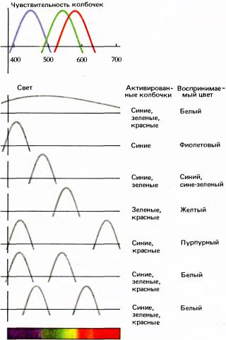
Rice. 120. The top graph - “cone sensitivity” - repeats the graph shown in Fig. 119. The following indicates which cones will be activated by different mixtures of colored light and what sensations will be produced.
Theories of color vision
Everything said above about the dependence of visible color on the stimulation of certain cones is based on research begun by Newton in 1704 and continuing to this day. The ingenuity that Newton showed in his experiments is difficult to overestimate: in his work on color, he split white light with the help of a prism; reunited its components with a second prism, again receiving white light; made a top with color sectors, which, when rotated, again produced a white color. These discoveries led to the realization that ordinary light consists of a continuous series of rays of different wavelengths.
In the 18th century it was gradually discovered that any color could be obtained by mixing three color components in proper proportions, provided that their wavelengths were sufficiently different from each other. The idea that any color can be "composed" by manipulating three controlling factors (in this case by changing the intensities of three different rays) is called trichromaticity. In 1802, Thomas Young put forward a clear and simple theory to explain trichromaticity: he proposed that at every point on the retina there must be at least three “particles”—tiny structures sensitive to red, green, and violet, respectively. The long time interval between Newton and Young is difficult to explain, but various “roadblocks”, such as, for example, the fact that yellow and blue paints mix to produce green, certainly did not contribute to clarity of thinking. The decisive experiments that finally directly and unequivocally confirmed Young's idea that color must be determined by a mosaic of three types of detectors in the retina were carried out in 1959: George Wald and Paul Brown at Harvard and Edward McNichol and William Marks at Johns Hopkins University studied under the microscope the ability of individual cones to absorb light of different wavelengths and discovered three and only three types of cones. Previously, scientists had made every effort using less direct methods, and over several centuries they actually came to the same result, proving Young's theory about the need for three types of cones and assessing their spectral sensitivity. Mainly psychophysical methods were used: scientists found out what color sensations are caused by various mixtures of monochromatic rays, how selective bleaching of receptors under the influence of monochromatic light affects color vision, and also studied color blindness.
Studying the effects of color mixing is extremely interesting - the results are so surprising and counterintuitive. No one without prior knowledge would have guessed the various phenomena illustrated in Fig. 120 and 121, - for example, could not predict that two spots, bright blue and bright yellow, when superimposed on each other, will merge into a white color, indistinguishable to the eye from the color of chalk, or that the green and red spectral colors, when combined, will give a yellow, almost indistinguishable from monochromatic yellow.
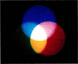
Rice. 121. Using three overhead projectors and three filters, three overlapping spots (red, green and blue) are projected onto a screen. Red and green when combined make yellow, blue and green make turquoise, red and blue make purple, and all three together make white.
Before discussing other color theories, some additional information needs to be given about the variety of colors that these theories purport to explain. What colors are there besides the colors of the rainbow? In my opinion, there are three types of such flowers. One type is purple, which is absent in the rainbow, but appears when red and blue cones are simultaneously stimulated, i.e. by mixing long and short wavelengths, or, roughly speaking, red and blue light. If to a mixture of spectral red and spectral blue light - purple - we add the proper amount of green, we get white; so we say green and magenta are complementary. You can, if you like, imagine a circular scale including all the colors of the spectrum from red through yellow and green to blue and violet, and then moving on to the purple colors - first to bluish-purple, then to reddish-purple and finally back to red. You can arrange these shades so that complementary colors are opposite each other. Concept primary colors does not fit into this scheme: if we define the primary colors in accordance with the three types of receptors, then we will highlight greenish-yellow, green and violet, i.e. shades that are hardly consistent with the idea of three pure basic colors. But if by basic we mean three colors from which any other shade can be obtained, then the three mentioned colors satisfy this criterion, as do any other three colors that are sufficiently far apart from each other. Thus, none of the above justifies the idea of three single primary colors.
The second type of color is obtained by adding white to any color in the spectrum or to purple; we say that such an addition “dilutes” the color, makes it paler - in professional language they say that white reduces saturation colors. To select two identical colors, we must make them the same in hue and saturation (by choosing, for example, the appropriate position on the color wheel and then adding the right amount of white), and then equalize them in intensity. Thus, we can define a color by specifying the wavelength of the light (or, in the case of purple, its complementary color), the relative content of white light, and a number indicating the intensity. A mathematically equivalent way to define color is to specify three numbers representing the relative influences of light on the three types of cones. In any case, three numbers are needed.
A typical example of a third type of color that does not fit into the above explanations is brown. I'll come back to it later.
Hermann Helmholtz accepted and defended Jung's theory, which became known as the Jung-Helmholtz theory. By the way, it was Helmholtz who finally explained the phenomenon mentioned at the beginning of this chapter, which consists in the fact that a mixture of yellow and blue paints gives green. You can easily see how different this is from mixing yellow and blue Sveta, by doing the following experiment, for which you will only need two overhead projectors and some yellow and blue cellophane. First, attach yellow cellophane to the lens of one projector and blue cellophane to the lens of the other, and overlap the projected images. By adjusting the relative intensities, you will obtain pure white light in the overlap area. We have already considered this type of color mixing; As we explained then, white light occurs because combined exposure to yellow and blue light activates all three cone systems with the same relative efficiency as broadband, or white, light. Now turn off one projector and place both filters in front of the other; you will get green color. To understand why this happens, we must know that blue cellophane absorbs the long-wavelength part of white light, i.e. yellow and red, and the rest, which appears blue, is passed through, while the yellow filter absorbs mostly the blue part, and the rest, which appears yellow, is passed through. Scheme in Fig. 122 shows the spectral composition of the light transmitted by each filter. Note that in both cases the transmitted light is far from monochromatic. Yellow light is not narrowband spectral yellow, but a mixture of spectral yellow with shorter green, longer orange and red wavelengths. Likewise, blue is spectral blue with some green and violet mixed in. Why, then, do we see only yellow or only blue? The fact is that the sensation of yellow is the result of equal stimulation of red and green cones without any effect on the blue cones; Such stimulation can be carried out either with spectral yellow (monochromatic light with a wavelength of 580 nm) or with a wider wavelength “smear”, which is usually characteristic of pigments - it is only necessary that the width of the spectrum is not excessively large and the spectrum does not contain short waves that stimulate blue cones. Likewise, spectral blue light has about the same effect as blue plus green plus violet. Now when we use two filters, one in front of the other, we get what? miss both filter, i.e. green rays. It is in this region that those shown in Fig. overlap. 128 graphics for broadband blue and yellow light. The same thing happens with paints: yellow and blue paints together absorb all the light except the green areas, which are reflected. Note that if we had used monochromatic yellow and blue filters in our experiment, placing them one in front of the other, they would not have missed anything. Mixing occurs only because the light transmitted or reflected by the colorants has a broadband spectral composition.
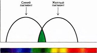
Rice. 122. The blue filter transmits a fairly wide spectral band centered at 480 nm, and the yellow filter passes the same band centered at 580 nm. Both filters together transmit only the rays common to them - light in a fairly narrow band centered around 530 nm, which gives green color.
Let's summarize this long-winded explanation of why "yellow plus blue equals green" with the following brief statement about color and dyes: two filters placed one in front of the other, or two mixed dyes, work together to absorb all but medium wavelengths of white light, i.e. green.
Why am I discussing this phenomenon here? Partly because it explains the dramatic and sensational result of mixing yellow and blue to create green, but even more because of the historical importance of this result in confirming our understanding of color vision. This phenomenon is physical; it has to do with color vision and biology in much the same way that crossing polaroids to get black, or adding blue litmus to acid to get red, is to do with them - in short, nothing at all. And yet, the idea of the connection between color mixing and color vision continues to confuse many, and this is due to the idea that red, yellow and blue are primary colors, and green is not. If any set of colors can be considered primary, it is four colors - red, blue, yellow and green. As we will see in the section on Hering's theory, the basis on which all four colors can claim to be primary colors has little to do with the three types of cones and much more to do with the subsequent processing of information in the retina and brain.
(This does not in any way devalue the painter's knowledge of the fact that with just three colors you can imitate most color shades. But even a master in his field can make mistakes. In one book on weaving, in the chapter outlining the theory of color, I found a statement that if you mix yellow and blue threads in a fabric, you will get a green color. In fact, you will get a gray color - for biological reasons.)
Color blindness
From the work of J. Wald, W. Rushton and many others, we know that the common form of color blindness, which affects about 8 percent of men, is based on the absence or deficiency of one or more types of cones. The number of possible combinations of absence or quantitative deficiency of certain cones makes color blindness a very complex object of study.
Sometimes color blindness occurs in the left or right visual field after a local stroke in the contralateral or ipsilateral hemisphere. In this case, some higher cortical visual zone, located above the striate cortex and zone 18, is probably damaged - zone called V4 Semir Zeki from University College. We will talk about these higher zones in Chapter 10.
Hering's theory
Parallel to the Jung-Helmholtz color theory, a second scientific school arose and until recently seemed incompatible with it. Ewald Hering (1834–1918) interpreted the results of color mixing by suggesting that there were three colors in the eye and/or brain opponent process: one for the sensation of red and green, another for yellow and blue, and a third, qualitatively different from the first two, for black and white. Goering was struck by the absence (impossible to even imagine!) of colors that could be described as yellowish-blue or reddish-green, as well as the “mutual destruction” of blue and yellow or red and green when mixed in the proper proportions - the color completely disappears, i.e. there is a feeling of white color. Hering considered the red-green and yellow-blue processes to be independent in the sense that a mixture of blue and red produces bluish-red, or purple; similarly, a mixture of red and yellow produces orange, a mixture of green and blue produces bluish-green, and a mixture of green and yellow produces chartreuse. In Hering's system, yellow, blue, red and green can be considered "primary" colors. Looking at orange, everyone can imagine it as the result of mixing red and yellow, but no one can look at red or blue and see it as the result of mixing any other colors. (The feeling that some people have that green looks like yellow with a hint of blue is probably due to their childhood experiences with paint sets.) To many it seemed that Hering's ideas about the blue-green and yellow-blue processes were based only on intuitive impressions of color. But it is striking how well the opinions of people who are asked to indicate the point of the spectrum where pure blue is represented without any apparent admixture of green or yellow are in agreement. The same can be said about yellow and green colors. As for the red color, the subjects' assessment is again the same, but in this case they insist that a little violet should be added to eliminate the slightly noticeable yellowness of the long-wave light. [It is this subjective red that, when added to green, produces white; normal (spectral) red added to green produces yellow.]
We can compare the yellow-blue and red-green Hering processes with two instruments, like old voltmeters, one of which deflects the needle to the left when registering yellow and to the right when registering blue, and the other instrument behaves exactly the same in relation to the red-green pair. The color of the object can be described by the readings of two instruments. Hering's third antagonistic process (which can be thought of as a third voltmeter) records the ratio of black and white. Hering understood that the sensation of black and gray is not generated simply by the absence of light coming from some object or surface, but arises if and only if less light comes from the object than the average of the surrounding areas. The sensation of white occurs only if the background is darker and there is no color (I already discussed this in Chapter 3 using the example of a turned off TV). According to Hering's theory, the black-and-white process involves spatial comparison or subtraction of reflectances, while its yellow-blue and red-green processes occur in one specific area of the visual field and are not related to the surroundings. (Hering undoubtedly knew about the interaction of neighboring colors, but his theory of color, as formulated in his later works, does not include these phenomena.) We have already seen that black and white are actually represented in the retina and in the brain by spatially separated processes of excitation and inhibition (on-off), which are literally antagonistic.
Hering's theory made it possible to explain not only all spectral colors and saturation levels, but also colors such as brown and olive green, which are absent in the rainbow and cannot even be reproduced in any of the classical psychophysical color mixing procedures in which we use an overhead projector to cast spots of light onto a dark screen. We will get a brown color only if the yellow or orange light spot is surrounded by, on average, brighter light. Take any brown surface, look at it through a piece of rolled up black paper to exclude all its surroundings, and you will see yellow or orange. We can consider brown a mixture of black, obtained only in conditions of spatial contrast, with orange or yellow. According to Hering's terminology, at least two systems work in this case - black and white and yellow and blue.
Hering's theory of three opponent systems - red-green, yellow-blue and black-white - in his time and for another half century was considered as an alternative to the three-component ("red, green, blue") theory of Jung - Helmholtz. Supporters of each of them were, as a rule, very fanatical and often overly emotional. Physicists tended to fall into the Jung-Helmholtz camp, perhaps because they were attracted to quantitative arguments (such as systems of linear equations) and repulsed by arguments involving color purity. Psychologists often sided with Hering, probably due to the fact that they had to deal with a wider variety of psychophysical phenomena. Hering's theory seemed to argue for either four types of receptors (red, green, yellow and blue) or three (black-white, yellow-blue and red-green); both options contradicted the accumulating evidence that supported Young's original hypothesis. In retrospect, as modern psychophysicists Leo Gurwitch and Dorothea Jameson have noted, one of the difficulties was due to the absence of any direct physiological evidence of inhibitory mechanisms in sensory systems before the 1950s. Such data appeared only when it became possible to record the activity of single neurons.
If you imagine voltmeters measuring positive values to the right and negative values to the left, you can understand why Hering's theory assumes the presence of braking mechanisms. Yellow and blue colors are mutually antagonistic; mixing, they destroy each other, and if the arrow of the red-green system also points to zero, then there is no color. Goering was, in a sense, fifty years ahead of his time. As has happened before in the history of science, two theories that for decades seemed incompatible have both turned out to be correct. At the end of the last century, no one could have imagined that the ideas of Jung and Helmholtz would be true for the receptor level, and Hering’s ideas about opponent processes would be true for subsequent levels of the visual system. It has now become clear that these two formulations are not mutually exclusive: they both assume the presence of a system with three variables - these are the three types of cones in the Young-Helmholtz theory and the three measuring instruments or processes in Hering's theory. What amazes us today is that Hering, based on such limited factual material, was able to formulate a theory that fits so well with the neural organization of the central mechanisms of color vision. However, color vision experts are still divided into two camps: some consider Hering a prophet, while others see the said correspondence as merely a fluke. I will certainly make enemies among both, since I take a neutral position and am only slightly inclined in favor of the first opinion.
Color and space
In Chapter 3, we saw that perceiving an object as white, black, or gray depends on its relative ability to reflect light compared to other objects in the visual field. Thus, the properties of the broadband cells of the lower levels of the visual system - retinal ganglion cells and geniculate cells - can largely explain the perception of black, white and gray: this is the comparison they make with the help of their receptive fields with the center and periphery. Undoubtedly, this is precisely what Hering’s third, spatially opposing black-and-white process consists of. The fact that the spatial variable is important for the perception of other colors was first realized a century ago; however, an analytical approach to this issue began to be developed only in recent decades, mainly through the efforts of psychophysicists such as Leo Gurvich and Dorothea Jameson, Dean Judd and Edwin Land. Land, with his deep interest in lighting and photography, was naturally intrigued by the camera's inability to compensate for differences in light sources. If photographic film is balanced so that the image of a white shirt appears white under tungsten incandescent light, then the same shirt under a blue sky will appear light blue; if the film is intended for natural light, the shirt will appear pink in ordinary electric light. When taking a good color photograph, we must consider not only the intensity of the light, but also its spectral composition - whether the light will be bluish or reddish. If we know this, we can set the shutter speed and aperture based on intensity and select film or filters based on color balance. Unlike a camera, our visual system does all this automatically; it solves this problem so well that we usually don't even realize the problem exists. A white shirt appears white despite large shifts in the spectral composition of light from the zenith of the sun to the setting sun, tungsten, or fluorescent lamp. The same constancy holds for colored objects, and this phenomenon, when applied to colored and white, is called color constancy. Although constancy has been known for a long time, Land's demonstrations in the 1950s came as a big surprise even to neurophysiologists, physicists and most psychologists.
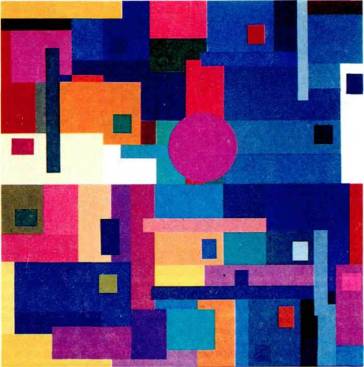
Rice. 123. In many of his experiments, Edwin Land used mosaics of colored paper strips in the Mondrian style. The purpose of the experiments was to prove that perceived colors remained remarkably constant despite marked changes in the ratio of red, green and blue rays used to illuminate the mosaic.
What are these demonstrations? In a typical experiment, a mosaic of rectangular pieces of paper of different colors, reminiscent of Mondrian's drawings, is illuminated by three overhead projectors, one equipped with a red, another green, and a third blue filter. Each projector has an adjustable light source, so its intensity can be varied within wide limits. Otherwise, the room should be completely darkened. If all three projectors are set to medium intensity, the colors will look about the same as in daylight. Surprisingly, the exact setting doesn't seem to matter. Let's select a green section of the mosaic and use a photometer to accurately measure the intensity of the light coming from it when only one projector is turned on. Then we repeat the measurement with the second projector, and then with the third. This will give us three numbers that represent the light reflected when all three projectors are turned on. Let us now select another area, for example orange, and adjust the intensity of each projector one by one so that the photometer readings for the orange area coincide with those we obtained earlier for the green area. Thus, when three projectors are turned on, the light now coming from the orange area is identical in composition to that which came from the green area a minute earlier. What can we expect to see? Reasoning in a primitive way, we will say that the orange area has turned into green. But it still looks orange - its color hasn't even changed at all. We can repeat this experiment with any two areas. The bottom line is that it doesn't really matter what light intensity the three projectors are set to as long as some light is coming from each of them. In almost every case we will notice only very small changes in perceived color.
Such experiments have convincingly shown that the sensation arising in any part of the visual field depends both on the light coming from that part and on the light coming from other areas. Otherwise, how could light of the same spectral composition cause the sensation of green in one case and the sensation of orange in another? The principle applicable to black, white and gray and so clearly formulated by Hering turns out to be true also in relation to color. For color we have not only local oppositivity (red/green and yellow/blue), but also spatial one: red/green in the center versus red/green on the periphery and a similar oppositivity for yellow/blue.
In 1985, David Ingle in Land's laboratory managed to teach a goldfish to swim to an area of a certain color in an aquarium with an underwater mosaic of multi-colored rectangles. He discovered that the fish swims to the same color, for example blue, regardless of the spectral composition of the light: it, like us, chooses the blue area, even if the light from it is identical in composition to the light that in the previous test with a different light source came from the yellow patch rejected by the fish. Thus, the fish also selects a surface area based on its own color, and not on the spectral composition of the light it reflects. This means that the phenomenon of color constancy should not be considered some kind of improvement recently added in the course of evolution to the color perception of some higher mammals, including humans; its presence in fish indicates that it is a primitive, very general aspect of color vision. It would be very tempting (and fairly easy) to test whether insects with color vision have the same ability. I think that's exactly the case.
Land and his group (J. McCann, N. Dow, M. Burns, and H. Perry, among others) developed several procedures for predicting the apparent color of some object from the spectral-energy composition of light from all points of the field of view, but without any information about the light source. The calculation consists of determining for each of three separate projectors the ratio of the light coming from the place whose color needs to be predicted to the average light coming from the surroundings. (The area of the “environment” that needs to be taken into account varies in different versions of Land’s theory. The newest version assumes that the influence of surrounding areas decreases with distance.) The resulting triple of numbers - the ratios are taken for each projector - uniquely determines the color of a given place. Any color, therefore, can be associated with a certain point in three-dimensional space, the coordinate axes of which will be three ratios obtained for red, green and blue light. To make the formulation as realistic as possible, three light sources are selected according to the spectral sensitivity curves of the three types of human cones.
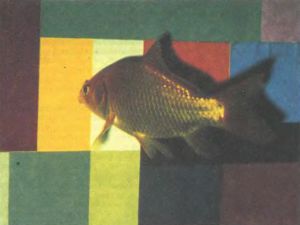
Rice. 124. In David Ingle's experiments, a goldfish was trained to swim for a reward - a piece of liver - to a strip of a given color. It floats, for example, to the yellow stripe regardless of the ratio of light intensities from three projectors. This behavior is strikingly similar to the constancy of color perception in humans.
The fact that color can be calculated in this way means that there is color constancy, since for each projector it is calculated ratio light from one area to light from the average surroundings. The exact setting of the light intensity in projectors is no longer important: the only condition remains that we must have some kind light from each projector - otherwise no relationship could be calculated. One implication of all this is that for color to appear there must be differences in the spectral composition of light within the visual field. We need color boundaries to perceive color, just as we need luminance boundaries to perceive black and white. You can easily verify this by using two overhead projectors again. Place a red filter in front of one of the projectors (red cellophane will do) and illuminate any group of objects. I prefer to wear a white or yellow shirt and a bright red tie. In this light, neither the shirt nor the tie looks quite red: both appear pinkish and as if faded. Now illuminate the same combination of objects with a second projector, covering it with blue cellophane. The shirt will appear pale bluish and the tie black: red objects do not reflect short wavelengths of light. Go back to the red projector and double check that the tie doesn't look particularly red. Now add a blue projector. You know that when you add blue light, you won't get any extra reflection from the tie - you just demonstrated that - but when you turn on the blue projector, the red tie will suddenly sparkle a nice bright red. This will convince you that it is not only the rays coming from the tie that make the tie red.
Experiments with stabilized color boundaries are consistent with the idea that differences at boundaries are necessary to see color in general. Alfred Yarbus, whose name was mentioned in Chapter 4 in connection with eye movements, showed in 1962 that when looking at a blue spot surrounded by a red background, stabilization of the edge of the spot on the retina causes it to disappear: the blue disappears and all that can be seen is the red background. Stabilizing the borders on the retina clearly renders them ineffective, and without them the color disappears.
This psychophysical evidence that color perception requires differences in the spectral composition of light from different parts of the visual field points to the possible presence of cells in our retinas or brains that are sensitive to color boundaries. This argument is similar to the one we made in Chapter 4 regarding the perception of black or white objects. If, at some level of our visual system, color information is transmitted only along lines of color contrast, then cells with receptive fields that lie entirely within regions of uniform color will be inactive. The result is savings in information processing. Thus, by transmitting color information only at the boundaries, we get two advantages: first, the color does not change with changes in illumination, so that we learn about the properties of the objects in question without distortions introduced by the light source; secondly, information is processed in an economical way. Now we can ask: why did the system evolve in this way? Was the need for color constancy the main factor in evolution, and was economy just an accompanying benefit? Or, conversely, economy played a leading role, and constancy a secondary one. The second assumption may seem more convincing to many: it is unlikely that evolution could have foreseen the advent of incandescent or fluorescent lighting, and our shirts were not so white at all until the advent of modern detergents.
Physiology of color vision: early results
The first physiological information at the cellular level was obtained 250 years after Newton in the studies of the Swedish-Finnish-Venezuelan physiologist Gunnar Svetikhin, who in 1956, using a bony fish, carried out intracellular recording of the activity of retinal neurons - at first he mistook them for cones, but they turned out to be horizontal cells. These cells responded to retinal illumination only with slow potentials (no action potentials were observed). As shown in Fig. 125, Svetikhin discovered three types of cells: the first type, which he called L-cells, hyperpolarized upon light stimulation regardless of the spectral composition of the light; the second type, called r-g cells, was hyperpolarized by short wavelengths with a maximum response to green light and depolarized by long wavelengths with a maximum response to red light; the third type, called y-cells taking into account Hering’s theory, responded like r-g cells, but with a maximum of hyperpolarization to blue light and a maximum of depolarization to yellow light. In r-g and y-b cells, white light evoked only weak and rapidly decaying responses, as would be expected due to the broadband spectral-energy composition of white light. Moreover, in both of these types of cells, which we can call opponent color cells, light with some intermediate wavelength called cross point, did not cause any reaction. Because these cells respond to colored light but not white light, they are likely involved in color sensations.
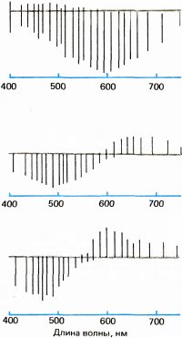
Rice. 125. Gunnar Svetikhin and Edward McNicol recorded the reactions of horizontal cells to color in bony fish. Deviations downward from the gray line correspond to hyperpolarization, and deviations upward correspond to depolarization.
In 1958, Russell de Valois and his collaborators recorded responses strikingly similar to Svetihin's from cells in the lateral geniculate body of the macaque monkey. Previously, using behavioral tests, de Valois had shown that the color vision of macaques and humans is almost the same; for example, the ratio in which two colored rays must be mixed to produce a third color is almost identical in both species. Therefore, we can think that macaques and humans have similar mechanisms at the lower levels of the visual system, and we, apparently, have the right to compare the psychophysics of color in humans with the physiology in macaques. De Valois found that many cells in the geniculate body were activated by scattered monochromatic light in the range from one end of the spectrum to the crossover point, where there was no response, and were suppressed by light in the second range, from the crossover point to the other end of the spectrum. Once again, the analogy with Hering's color processes was complete: de Valois identified two types of opponent-color cells, red-green and yellow-blue; in each type, the mixing of two light waves, the lengths of which on the wave scale were located symmetrically relative to the crossover point, led to mutual cancellation of reactions in the same way as in perception the addition of blue to yellow or green to red produces white. De Valois's results agreed particularly well with Hering's formulations, since the two groups of color cells had response maxima and crossover points exactly at those places on the spectral scale so that one group could reflect the "yellow-blue" properties of the incident light, and the other group the "red-green" properties.
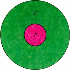
Rice. 126. In a typical type 1 receptive field, the center sends excitatory signals from red cones, and the periphery sends inhibitory signals from green cones.
The next step was to look at the receptive fields of these cells using small colored spots instead of scattered light; This is what we did in 1966 together with Thorsten Wiesel. The receptive fields of most opponent-color de Valois cells showed an amazing organization that still baffles us. The cells, like those of cats according to Kuffler, had fields divided into two antagonistic areas - the center and the periphery; the center could be of type on or off. In a typical case, the center of the field is represented exclusively by red cones, and the inhibitory periphery - exclusively by green cones. Therefore, under red light, both a small and a large spot causes a vigorous reaction, since the center is selectively sensitive to long-wave light, and the periphery almost does not react to it; with short-wave light, small spots give only a very weak reaction or do not cause it at all, while large spots generate strong inhibition with off-reactions. In white light, which contains short and long wavelengths, small spots cause on-reactions, while large spots do not cause a response.
Although our first impression was that such a cell would receive input from the red cones centrally and green cones from the periphery, it now seems likely that the complete receptive field includes two overlapping systems, as shown in Fig. 127. Both red and green cones are distributed over a fairly wide circular area, and their number is maximum in the center and decreases with distance from it. In the center, red cones greatly predominate, but towards the periphery their number decreases much faster than the number of green cones. Therefore, a small spot flaring in the center and containing a long-wavelength component will be a very powerful stimulus for the red system; even if it stimulates the green cones, their number compared to the total number of green cones associated with the cell will be too small to provide any competition to the red system. The same considerations apply to the cells with a center and a periphery described in Chapter 3, the receptive fields of which should also consist of two opposing circular overlapping zones with different shapes of sensitivity-coordinate curves. Thus, the periphery is probably not ring-shaped, as originally thought, but circular in shape. For these monkey opponent-color cells, it has been suggested (though without sufficient evidence) that the peripheral regions reflect the contribution of horizontal cells.
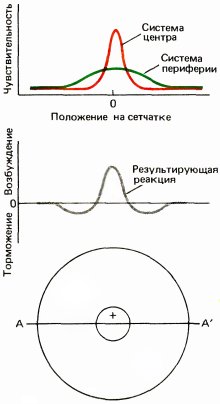
Rice. 127. The graphs above show the dependence of the sensitivity of a neuron (measured, for example, by the response to a stationary very small spot of light) on the position of the stimulus on the retina along line AA passing through the center of the receptive field. For a cell with r-center and g–- on the periphery, a red spot gives a peaked curve, and a green spot gives a much wider curve. The bottom graph shows the response to white or yellow light stimulating both opposing systems, so that the contributions of the two systems are subtracted. In this case, red cones dominate in the center, which leads to on-reactions, and green cones dominate in the periphery, which leads to off-reactions.
Responses to diffuse light—in this case, on responses to red, off responses to blue and green, and no response to white light—clearly indicate that such a cell must register color information. But the responses to certain types of white edges and the lack of responses to diffuse light suggest that this cell is also associated with the perception of shape. We call these color-opponent cells with a center and a periphery “type 1” cells.
The external geniculate body of the monkey, if we recall the information from Chapter 4, contains six layers, with the upper four layers containing many small cells, and the lower two containing a smaller number of large cells. We find cells of type 1 described above in the upper, or parvocellular, layers. They differ in the type of cones included in their central and peripheral systems, and in the nature of the center, which can be excitatory or inhibitory. The example shown in Fig. 126, we can denote it as r+g– (with a red center and green periphery). Among the cell subtypes receiving inputs from red and green cones, we find all four possible options: r+ g–, r– g+, g+ r–, g– r+. The second group of cells receives input from blue cones in the center of the field and from a combination of red and green (or perhaps just green) from the periphery. We call such cells “blue-yellow,” and the word “yellow” is used here for brevity instead of “red plus green.”
In the four upper layers we find two more types of cells. Type 2 cells make up about 10 percent of the neuronal population and have center-only receptive fields. Throughout this center, some cells exhibit red-green, while others exhibit blue-yellow opposition. The receptive fields of about 15 percent of cells in the upper four layers of the geniculate body and all cells in the lower two (magnocellular) layers have a center and a periphery, but these cells do not show color preferences; it appears that the center and periphery of their fields receive the same relative contribution from all three types of cones. We count these cells broadband and in the upper layers we call them type 3 cells.
All these data are strikingly consistent with Hering’s model: in addition to two classes of cells with color opponentity, we also have a third class that does not have this property at all, but with broadband spatial opponentity. What does not seem to be consistent with any theory is the spatial organization of fields in opponent-color cells—type 1 cells. At first glance, one might think that this organization is somehow related to color contrast, i.e. with the tendency of one color, such as blue, to appear brighter when surrounded by another color, such as green, or with a piece of gray paper appearing yellowish when seen against a blue background. But a moment's reflection will convince you that the cells of the geniculate body can hardly be useful for this type of color contrast: the cell with r described above+-center and g–- the periphery will not be strongly excited by a red spot on a green background - it will respond very weakly or not at all, since one effect will be destroyed by the other; the opposite of what is needed to enhance color contrast will occur.
All that can be said about type 1 cells is that, based on their numbers, they must be the most important source of color information for the brain, although this information is presented in some strange way. Their possible work together with type 3 cells is very consistent with Hering's ideas about two opponent color systems and one opponent spatial system. They are also likely to play an important role in the perception of fine details of the shape of objects, since the only other geniculate cells with small field centers are broadband type 3 cells, which are ten times smaller. As we saw in Chapter 6, visual acuity, i.e. the ability to distinguish small objects can be measured in several ways; one can, for example, determine the smallest distance between two points at which they do not yet merge, or the smallest visible gap in a circle (the so-called Landolt ring). Acuity measured by any of these methods is found to be on the order of 0.5 arcminutes for the fovea, or about 1 millimeter at a distance of 8 meters. This indicator agrees well with the distance between the two cones in the fovea. Type 1 geniculate cells, which receive input from the fovea, have receptive fields centered on the order of 2 arcminutes in diameter. It seems likely that the center of the field here is just one cone. Thus, we find a reasonable correspondence between visual acuity and the smallest dimensions of the receptive field center in the cells of the lateral geniculate body.
The ventral (lower) pair of layers of the geniculate body differs from the four dorsal layers in that it consists exclusively of cells with broad field centers. These cells exhibit a curious form of color oppositionality, the meaning of which no one understands and about which I will not talk in more detail. Most consider these cells to be “color blind”. The centers of their fields are several times larger than the centers of neurons in the small cell layers, and they have a number of other interesting features. We currently suspect that these cells serve parts of the brain that play an important role in the perception of shape, depth, and motion. The development of this topic would lead us far away from color, and it would be necessary to write another book.
Most of the cell types described for the lateral geniculate body are also found in the retina. In the geniculate body they are more isolated, which makes them easier to study. The contribution of the geniculate body to the analysis of visual information in monkeys is still unknown.
Neural basis of color constancy
Since type 1 cells of the lateral geniculate body do not seem to be equipped for color-spatial comparisons, we apparently need to move to higher levels of the visual system. To test the idea that such comparisons might occur in the cerebral cortex, Land's group, Margaret Livingston, and I studied a man whose corpus callosum had been transected to treat epilepsy. There were no spatial-color interactions between areas separated by the middle vertical of the visual field: the color of a spot located just to the left of the point at which this subject was looking was not affected even by sharp color changes in the right visual field, while normal subjects reported noticeable changes in such cases. This means that color-spatial interactions apparently cannot occur in the retina itself. Although no one seriously argued otherwise, the question continued to be discussed, and it was nice to get some experimental data. The results of this experiment are consistent with the fact that we were unable to detect ganglion cells in the retina that could well be involved in color-spatial interactions.
The goldfish, which makes spatial comparisons as well as you and I, has virtually no cerebral cortex. Perhaps the fish, unlike us, makes these comparisons using its retina. Discovery in fish retina double opponent cells (N. Doe, 1968) seems to confirm this. In monkeys (see next section) we find such cells in the cortex, but they are not in the retina or in the lateral geniculate body.
Bubbles
By about 1978, the primary visual cortex of monkeys, with its simple and complex cells, line-end neurons, eye-dominant and orientation columns, seemed to be well understood. But an unexpected feature of her physiology seemed to be that only a few cells here were not indifferent to color. When we mapped the receptive field of a simple or complex cell using white light and then repeated the experiment with colored spots or stripes, the results were generally the same. However, some cells, perhaps only a tenth of all neurons in the upper layer of the cortex, showed clear color preferences - vigorous responses to an oriented stripe of, say, red, but no responses to other colors or even to white. The orientation selectivity of these cells was no lower than that of cells insensitive to color, but most neurons were indifferent to color. All this seemed especially strange in view of the fact that in the lateral geniculate body a very large proportion of cells encode color, and the geniculate body serves as the main source of information for the visual cortex. It was difficult to understand what could be happening with this color information in the cortex.
Suddenly, in 1978, everything changed. Seattle neuroanatomist Margaret Wang-Riley discovered that when the cortex was stained for the enzyme cytochrome oxidase, the upper layers revealed a never-before-observed heterogeneity - periodic dark-colored areas about a quarter of a millimeter wide, separated by intervals of about half a millimeter. Cytochrome oxidase, an enzyme involved in metabolism, is contained in all cells, and no one could even think that a histochemical reaction to this enzyme would allow us to see anything interesting in the cortex. When Wang-Riley sent us her photomicrographs, Torsten Wiesel and I suspected that we were seeing columns of ocular dominance in cross-section and that most monocular cells were for some reason more metabolically active than binocular cells. We put the pictures in a drawer and tried to forget about them.
Several years passed before we or anyone else had the opportunity to study slices of the primary visual cortex parallel to its surface using the same reaction. When this was finally done approximately simultaneously by two groups (Anita Hendrickson and A. Humphrey in Seattle and J. Horton and myself in Boston), a pattern resembling polka dot material emerged - to everyone's utter amazement. An example is shown in Fig. 129. Instead of stripes, we saw formations similar to bubbles, which were not associated with anything previously known. Wang-Riley irregularities were called by every imaginable name: dots, puffs, flies, specks. We called them “blobs” [blobs is a visual, institutionalized word (it’s even in the Oxford English Dictionary) and seems to annoy our competitors].
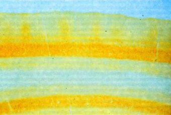
Rice. 128. This cross section of striate cortex shows layers stained for the enzyme cytochrome oxidase. The darker areas in layers 2 and 3 (vertical stripes at the top) are “bubbles”.
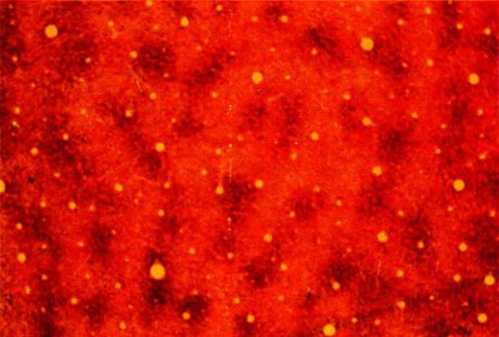
Rice. 129. Dark spots are bubbles visible “in plan”; About 50 of these bubbles form a characteristic pattern. The section is made through layer 3 parallel to the surface of the bark at a depth of about 0.5 mm. The cut passes along the border between fields 17 (left and middle parts) and 18 (right part), where there are no bubbles. (Yellow circles are cross sections of blood vessels.)
The next task was obvious: we had to again record the responses of cells in the striate cortex, histologically monitoring the experiment with cytochrome oxidase staining, and try to identify something special in the cells located in the vesicles. In 1981, Margaret Livingston and I began this work. The result was completely unexpected. By traveling a distance of a quarter of a millimeter, equal to the diameter of the vesicle, approximately five or six cells can be examined. Whenever we crossed a vesicle, the cells in the path of the electrode were completely devoid of orientation selectivity, which contrasted markedly with the high orientation selectivity of cells located outside the vesicles.
Two explanations could be given for this lack of orientation specificity. First, these cells could indiscriminately receive input signals from neighboring orientation cells lying outside the vesicles, and therefore were still able to respond with a specific response to the lines (stripes, etc.), but after combining all possible orientations, any preference for any of them disappeared. Second, they could be similar to geniculate cells or cortical layer 4C cells and thus simpler than extravesicular orientation-selective cells. The question was soon resolved: it turned out that most of these cells have receptive fields with a center and a periphery. Several additional experiments convinced us that many of them are involved in color coding.
More than half of the vesicle cells had opponent-color receptive fields with a center and periphery, but they behaved in a clearly more complex manner than type 1 cells of the lateral geniculate body. They practically did not respond to white spots of any size and shape. But to small spots of color flashing in the center of the receptive field, they responded vigorously in one wavelength range and were inhibited in another range; some were activated by long wavelengths (red light) and suppressed by short wavelengths (green and blue light), others behaved in the opposite way. As among the cells of the geniculate body, we could, depending on the position of the maximum reactions on the spectral scale, distinguish two classes - red-green and blue-yellow cells. (Here, as before, the words “red,” “green,” and “blue” indicate the corresponding types of cones, and the word “yellow” indicates the parallel inputs from the red and green cones.) Thus, these cells closely resembled the opponent-color cells of the geniculate body, possessing only a center (type 2). But unlike type 2 cells, these color-coding vesicle cells most often did not respond to large white or colored spots, no matter the spectral composition of the light. They behaved as if their central receptive field system was surrounded by a ring of opponentity. If we talk about the most common type of cells, then the center of type r+g–, seemed to be surrounded by a ring like r–g+.
Margaret Livingston and I named these cells double opponent because of their red-green or yellow-blue oppositionality in the center and the antagonism of the periphery in relation to any reaction in the center, be it on or off. Therefore, they do not respond not only to white light in any geometric configuration, but also to large spots, regardless of their spectral composition. The centers of the receptive fields, like those of type 2 cells, were several times larger than those of type 1 geniculate cells. As already mentioned, N. Doe introduced the term double opponents for the cells he discovered in the retina of a goldfish. He suspected that similar cells might be involved in color-spatial interactions in humans, and several years later, together with A. Pearlman, he diligently, although unsuccessfully, searched for such cells in the external geniculate body of the macaque.
In the late 1960s and later, dual opponent cells were occasionally found in the cortex of monkeys, but they were not clearly associated with any anatomical structures. We still don't understand some of their features. For example, in the type r cells just described+g– a red spot surrounded by green often produces a weak reaction instead of the vigorous one that might be expected.
Interspersed with double opponent cells of both classes (red-green and yellow-blue) there were also ordinary broadband cells with a center and a periphery. Were these broadband cells different from the cells in the upper layers of the geniculate body and from the cells in layer 4C? crust with larger sizes of their centers.
Margaret Livingston and I have proposed that the vesicles represent a branch of the visual pathway that deals with “color” in a broad sense, including shades of black, white, and gray. This system appears to be segregated from the rest of the visual pathway either in the lateral geniculate body or in layer 4 of the striate cortex. The geniculate body may have a direct, albeit weak, projection onto the vesicles. Does it seem likely that layer 4C is projected onto them? - maybe for them it is even the main source of input signals. Whether the 4C layer is projected onto them is unclear. Typically, the reaction of vesicle cells requires boundary contrast—either brightness boundaries, to which broadband cells with a center and periphery respond, or color-contrast boundaries, to which double opponent cells respond. As already stated, this is equivalent to the fact that such cells play a role in creating color constancy.
If cone cells are involved in color constancy, they cannot perform exactly the kind of calculations Land considered, namely comparisons between a region and its surroundings for each of the cone spectral subbands. Instead, they appear to be making a Hering-type comparison: matching red-green in one area with red-green in the surrounding background, and doing the same for yellow-blue and light intensity. But both ways of treating color—r, g, and b in one case, and b-w, r-g, and y-b in the other—are essentially equivalent. Color requires three variables: every color has a triple of numbers, and we can represent every color as a point in three-dimensional space. Points in such a space can be represented in more than one way. The coordinate system can be Cartesian with axes positioned at our discretion, or we can use polar or cylindrical coordinates. In Hering’s theory (probably in the retina and brain too) a different set of axes is simply used to describe the same space. This theory undoubtedly simplifies reality, since the vesicular cells belonging to the three classes are not at all as similar to each other as peas in a pod - they vary significantly in the relative strength of the periphery and center, in the perfection of the balance between opposing colors and in other characteristics, partly not yet fully understood. For now we can only say that physiology agrees surprisingly well with psychophysics.
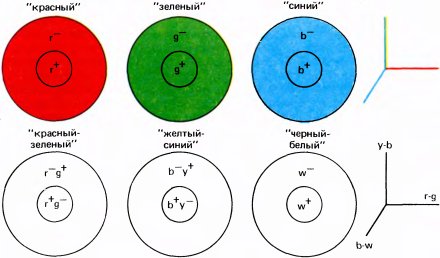
Rice. 130. Up: According to Land's formulation, color constancy is due to the presence of three types of cells that compare the activation of a given set of cones (red, green or blue) in some area of the retina with the average activation of the same set in the surrounding area. The result is three numbers that determine the color of this area. For example, yellow, brown, dark gray and olive correspond to certain triplets of numbers. We can thus display colors in some color space with three axes that correspond to red, green and blue.
Down: a mathematically equivalent system in which three numbers can also be given. It's probably closer to the way the brain defines colors. At any point on the retina we can talk about the degree of "red-greenness", measured by some kind of device that records the relative strength of stimulation of red and green cones (and shows zero for yellow and white). This value is determined for a given area, and its average value is determined for the environment; then the ratio of these quantities is calculated. The same process is repeated for the yellow-blue and black-white systems. The resulting three numbers are sufficient to specify any color.
The question may arise: Why did the brain need such seemingly strange axes to display color instead of the simpler system of r, g and b axes used in the receptive layer of the retina? Apparently, color vision was added during evolution to the “colorless” perception of lower mammals. The color space of these animals was one-dimensional, and different types of cones (if the animal had more than one type of cones) were combined into a common pool. During the evolution of color vision, two more axis were added to the already existing one. It was smarter than throwing away the existing black-and-white system and then creating three new systems. When we adapt to darkness and use only rods, our vision loses color and is mapped back to a single axis, which the rods apparently contribute to. This would not be so easy to do with the r, g and b axes.
At present, we can only guess what the connection pattern of double opponent cells is. In Fig. 131 shows one of the possible options for their connection with the cells of the upper layers of the geniculate body or with the cells of layer 4C? bark.
Needless to say, this is all purely speculative; all that matters is that double opposition somehow must be achieved: either its source is at the lower levels (retina or geniculate body), in which case we simply have not yet discovered cells of this type, or it must occur in the cortex. The presence of such cells in the retina of fish does not prove their existence in mammals. Scheme in Fig. 131 merely shows how the centers of the receptive fields might be formed: for the periphery we can always imagine the reverse procedure using cells r–g+ geniculate body, the fields of which widely overlap.
Our desire to consider color and shape as separate aspects of perception is thus confirmed by the physical separation of vesicular and non-vesicular areas of the primary visual cortex. In areas above the striate cortex - in visual area 2 and even higher - this isolation is preserved. We do not know where their unification occurs, if it occurs anywhere at all.
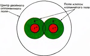
Rice. 131. A double opponent cell can be built with the help of many cells of the small cell layer of the lateral geniculate body. The large circle in the figure outlines the center of the receptive field of the double opponent cell; if the cell belongs to type r+g–, then its inputs can be numerous cells with center r+ and periphery g– and with a smaller central part of the field. Similarly, the periphery of a double opponent cell can be composed of elements of type r–g+.
Conclusion
The most interesting thing about color vision is that it is possible, by combining psychophysical and neurophysiological methods, to understand phenomena such as the results of color mixing or color constancy, which might otherwise seem completely mysterious. Problems related to color, while complex, are probably simpler than those related to form. Despite the discovery of orientation-specific cells or cells that respond to the ends of lines, we are still far from understanding our ability to recognize shapes, distinguish shapes from their background, or reconstruct a three-dimensional picture from flat images on the retina of each eye. The comparison of these two modalities - color and shape - can generally be misleading: remember that color differences at the boundaries alone, in the absence of any illumination differences, can lead to the perception of shape. Color in this sense is no different from black and white and serves only as one of the mechanisms for the manifestation of form.
Eye, brain, vision